Customize Your Dashboard
This document outlines how to create a custom chart in the Arthur dashboards.
-
Click the "+Create chart" button at the top of the dashboard
-
Click the "New Chart" title to give your chart a name
-
For the "Select raw table(s)", pick one of the following tables:
metrics_numeric_latest_version- for count-based metricsmetrics_sketch_latest_version- for sketch-based metrics
For this example, we'll use the
metrics_numeric_latest_versiontable.
Note: for more information on the contents of each table, please see
the Metrics & Querying Overview docs. -
Click Next
-
Enter a SQL query to populate the contents of your chart. Please see
the Metrics & Querying Overview document for more details on creating a
query. In this example, we'll use the following query for calculating inference count by day for this model.SELECT time_bucket('1 day', timestamp) as time_bucket_1d, CASE WHEN sum(value) IS NULL THEN 0 ELSE sum(value) END as count FROM "metrics_numeric_latest_version" where metric_name = 'inference_count' [[AND timestamp BETWEEN '{{dateStart}}' AND '{{dateEnd}}']] group by time_bucket_1d -
Click Preview data. At this point, you should see sample results populated for your chart
-
Click Next
-
Under the Build chart section, choose Chart type "Line", select
time_bucket_1das the X Axis -
Next, click "+Add Series", then Choose
countfrom the drop-down. The sample graph should now
populate on the right hand side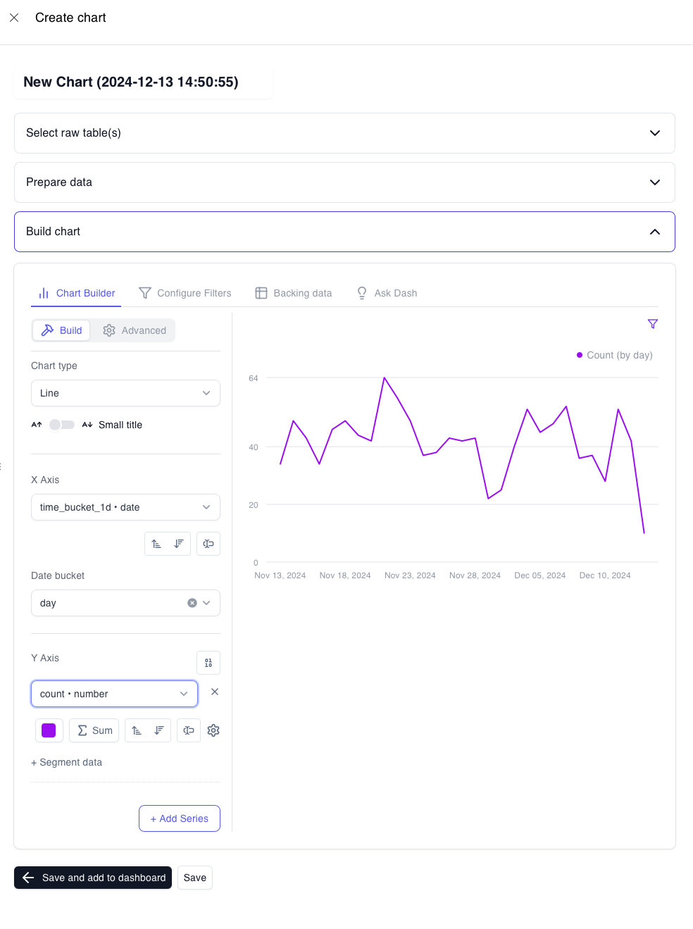
-
At this point, go back to the "Prepare data" section and update the query to the following SQL. This is needed to
autofill zeros for dates which do not have inferences. The variables{{dateStart}}and
{{dateEnd}}bound the range of data shown in the chart to match the selected range in the dashboard. We have to do
this after we configure the chart because the chart preview does not have a time range, so thedateStartand
dateEndvariables are not set. Once the chart is configured, we can change the SQL without issue to use the
time_bucket_gapfillfunction, which requires a start and end timestamp.SELECT time_bucket_gapfill('1 day', timestamp, '{{dateStart}}'::timestamptz, '{{dateEnd}}'::timestamptz) as time_bucket_1d, CASE WHEN sum(value) IS NULL THEN 0 ELSE sum(value) END as count FROM "metrics_numeric_latest_version" where metric_name = 'inference_count' [[ AND timestamp BETWEEN '{{dateStart}}' AND '{{dateEnd}}']] group by time_bucket_1d -
After the SQL is updated, the chart is ready to go. Scroll to the bottom and click "Save and add to dashboard"
-
The side panel should slide away, and the following pop up should appear. For the
DateStartdrop
down, select thedateStartvariable from your query. Similarly, for theDateEnddrop down, select thedateEnd
variable from your query. This steps links the variables to the chart level parameters.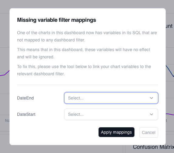
-
Click "Apply mappings"
-
Lastly, scroll to the top of the dashboard and click "Save". This will create a custom fork of the Arthur-provided
dashboard, that will always reflect the customizations you have made. Select Confirm to save your custom dashboard
and chart.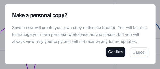
-
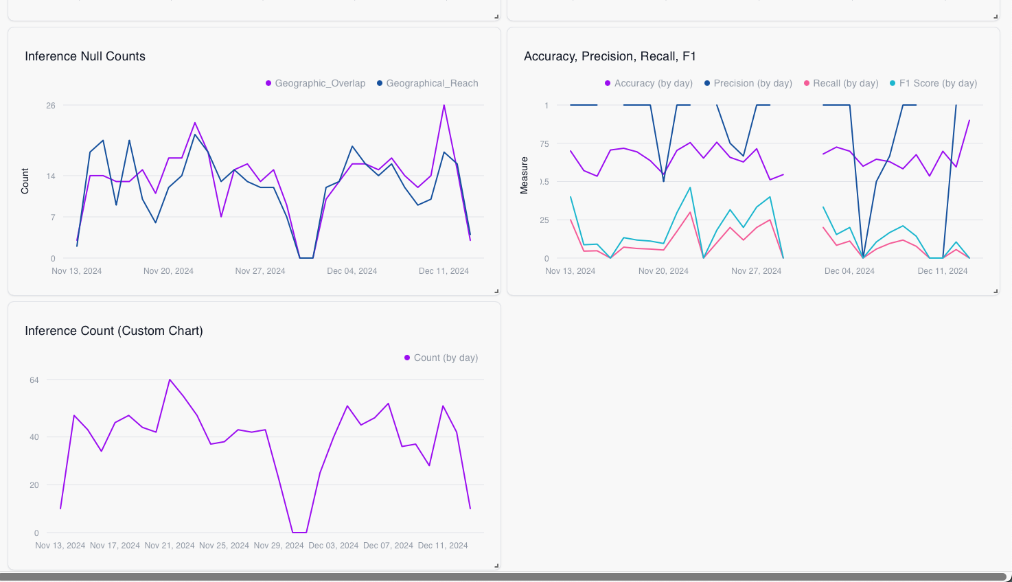
Your custom chart is now ready to go! Scroll down to the bottom of the dashboard to see your new chart. You can move
your chart around by dragging the top, or resize the chart by dragging the bottom right corner in our out.