
Anomaly Detection
Monitor and alert on incoming changes to your data distribution based on complex interactions between features
Go beyond single distribution analysis and look at complex interactions between features that may cause drift (multivariate). Both in low, but especially in high dimensional spaces where there is often data sparsity, anomaly detection can help capture changes in complex interactions between features.
Anomaly Detection in Practice
Anomaly Detection as Multivariate Drift
Model-based monitoring techniques allow you to look at inferences as a whole (not split by individual distributions) to better understand how many anomalous or weird inputs your model is receiving. Special use cases such as NLP and Computer Vision have different feature relationships than traditional tabular methods, which require model-based anomaly detection to capture their drift.
Search Out Anomalous Inferences
Easily investigate anomalous inferences by filtering by individual anomaly scores in the inference tab. While also available for Tabular or Text inputs, we can see this example in Arthur below.
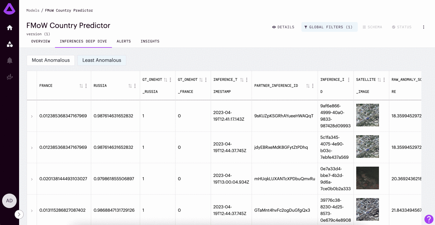
In the example gif provided above, we are looking into a model trained to detect whether or not a satellite image is from France or Russia. This model was only trained on satellite images of amusement parks. Here, we can see the most anomalous inferences are of stadiums (a context that the model was not trained to understand).
Teams frequently use this feature to find potential data pipeline issues, select inputs for re-training, and better understand the environment their model is running within.
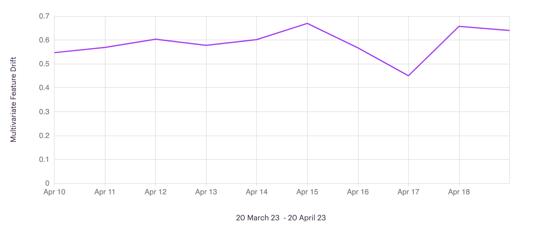
Inference Anomaly Score Distribution Chart
For each inference, teams can also visualize the anomaly score distribution chart. This chart represents all of the anomaly scores in your Reference Dataset as a point of comparison. Inferences are ranked on a scale of 0-1, where 0 represents no anomaly, and 1 represents an anomalous input.
Raw Anomaly Score (For Text and Image Input Types: As you can see in the visual above, there is the ability to visualize Raw Anomaly Score in the distribution chart. This is only available for text and image model types. The raw anomaly scores are the calculated loss of the model used to predict anomaly. Due to the way anomalies are scored against the reference dataset, we recommend using the raw anomaly score to track and sort anomalies in instances such as image quality assurance where all images are the same.
Understanding the Algorithm
To learn more about the algorithms used for anomaly detection. Please refer to the Arthur Algorithms documentation section.
Available Arthur Schemas
Anomaly Detection can be enabled for models with any Input or Output Type other than Time Series input type models. Only a reference data set is required - this can be a set of the model's train or test data. Once a reference set is uploaded, anomaly scores are calculated automatically.
Updated over 1 year ago
Learn more about enabling enrichments for your model in the Model Onboarding section. Otherwise, click on Hot Spots to learn about another type of enrichment.