
Arthur Algorithms
Anomaly Detection
For an explanation of how to enable Anomaly Detection with Arthur, please see the Anomaly Detection
Anomaly scores are computed by training a model on the reference set you provide to Arthur and using that model to assign an Anomaly Score to each inference you send to Arthur. Scores of 0.5 are given to "typical" examples from your reference set, while higher scores are given to more anomalous inferences, and lower scores are given to instances that the model judges as similar to the reference data with high confidence.
How Anomaly Detection Works
We calculate Anomaly Scores with an Isolation Forest algorithm. This algorithm works by building what is essentially a density model of the data by iteratively isolating data points from one another. Because anomalies tend to be farther away from other points and occur less frequently, they are easier to isolate from other points, so we can use a data point's "ease of isolation" to describe its anomaly. The method is based on the paper linked here.
The Isolation Forest "method takes advantage of two [quantitative properties of anomalies]:
i) they are the minority consisting of fewer instances and
ii) they have attribute-values that are very different from those of normal instances.
In other words, anomalies are 'few and different', which make them more susceptible to isolation than normal points."
The idea is to build a binary tree that randomly segments the data until each instance can be uniquely selected (or a maximum height is reached). Anomalous instances will take fewer steps to become isolated on the tree because of the abovementioned properties.
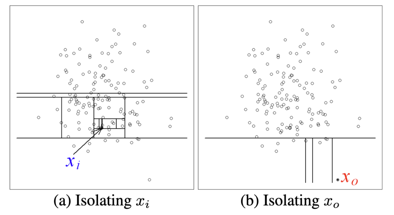
In the example above, we can see that the in-distribution x_i takes many more steps to reach than the out-of-distribution x_0
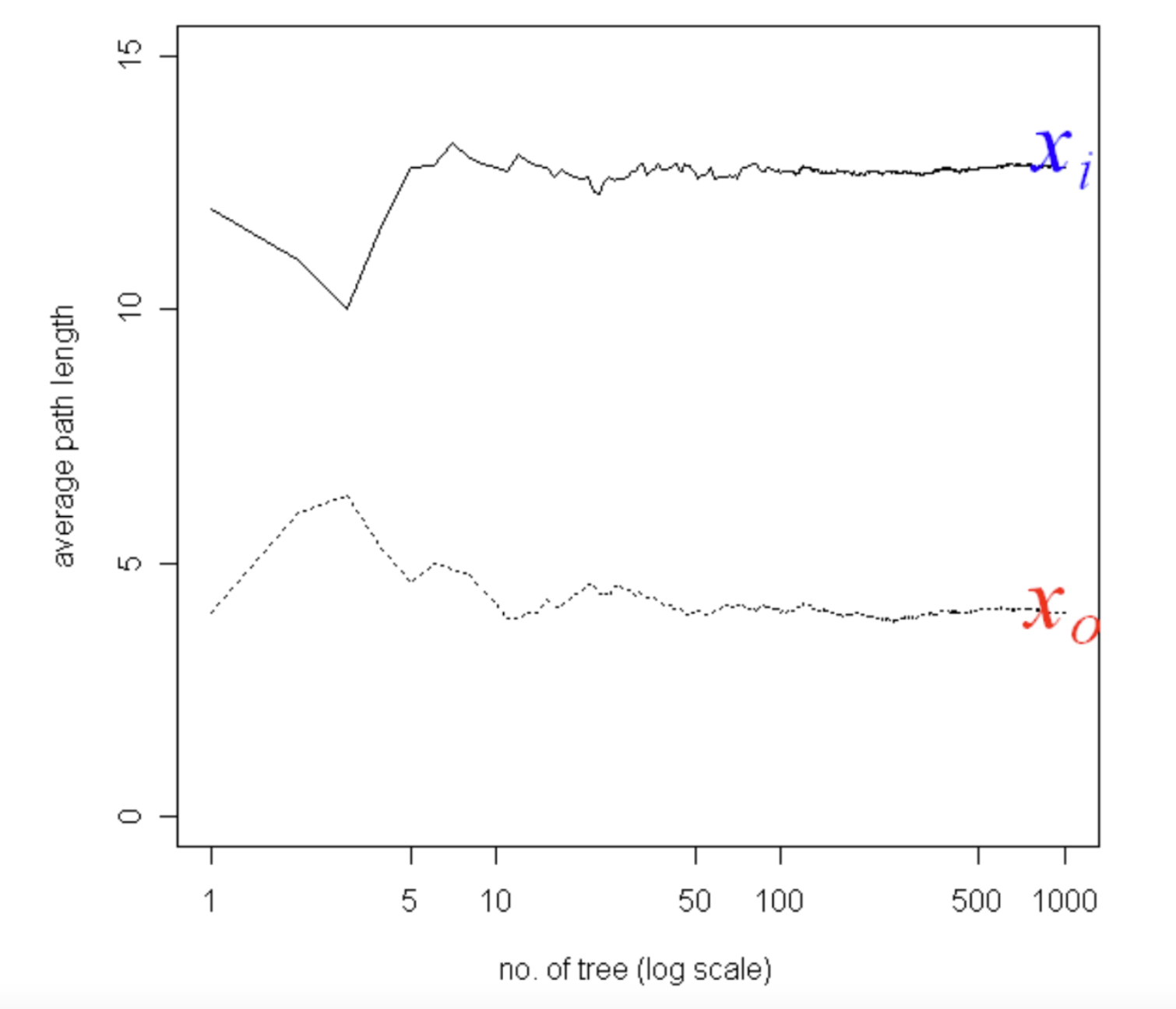
Of course, using a single randomly generated tree would be noisy. So we train multiple trees to construct an Isolation Forest of multiple trees and use the average path length, noting that average path lengths converge:
The Isolation Forest algorithm is highly efficient compared to other density estimation techniques because the individual trees can be built from data samples without losing performance.
When you add a reference set to your model in Arthur, we fit an Isolation Forest model to that data to compute an anomaly score for the inferences your model receives.
Generating Anomaly Scores
The path length, or the number of steps taken to reach the partition that a data point belongs to, varies between 0 and n-1 where n is the number of data points in the training set. Following our intuition above, the shorter the path length, the more anomalous a point is. To measure anomaly, an anomaly score between 0 and 1 is generated by normalizing the path length by the average path length and applying an inverse logarithmic scale.
In particular, the anomaly scores algorithm shown below is the average path length to data pointx from a collection of isolation trees and c(n) is the average path length given the number of data points in the dataset n.
Every inference you send to Arthur will be evaluated against the trained Isolation Forest model and given an anomaly score.
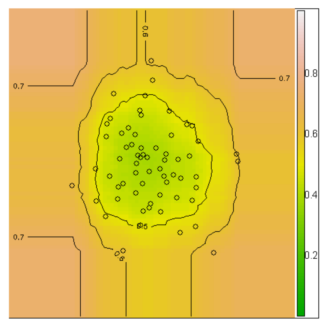
This can be seen in the anomaly score contour of 64 normally distributed points:
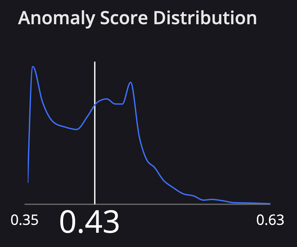
At Arthur, we also visualize the distribution of anomaly scores among all the inferences your model has retrieved since training. When you select an inference in our UI you'll see where it falls on this distribution:
Interpreting Anomaly Scores
The resulting anomaly scores can be interpreted in the following way:
- if instances return
svery close to1, then they are definitely anomalies - if instances have
ssmaller than0.5, then they are quite safe to be regarded as normal instances - if all the instances return
sapproximately at0.5, then the entire sample does not really have any distinct anomaly
Bias Mitigation
If you are interested in mitigation capabilities, we're happy to discuss your needs and what approaches would work best for you. Within the Arthur product, we offer postprocessing methods and encourage the exploration of alternate (pre- or in-processing) methods if your data science team has the bandwidth to do so.
We currently have one postprocessing method for the product: the Threshold Mitigator.
Threshold Mitigator
This algorithm is an extension of the Threshold Optimizer implemented in the fairlearn library, which in turn is based on Moritz Hardt's 2016 paper introducing the method.
The intuition behind this algorithm is based on the idea that if the underlying black box is biased, then different groups have different predicted probability distributions — let's call the originally predicted probability, for example, x the score s_x. Then, for a fixed threshold t, P(s_x > t | x in A) > P(sx > t | x in B), where _B indicates membership in the disadvantaged group. For example, the default threshold is t = 0.5, where we predict Y^ = 1 if s > 0.5.
However, we might be able to mitigate bias in the predictions by choosing group-specific thresholds for the decision rule.
So, this algorithm generally proceeds as follows:
- Try every possible threshold t from 0 to 1, where for any x, we predict Y^ = 1 if and only if s_x > t.
- Calculate each threshold's group-specific positivity, true positive, and false positive rates.
Let's say we're trying to satisfy demographic parity. We want the group-wise positivity rates to be equal — P(Y^ = 1 | A) = P(Y^ = 1 | B). Then, for any given positivity rate, the threshold t_a that achieves this positivity rate might differ from the threshold t_b that achieves this positivity rate.
This also hints at why we need the notion of tradeoff curves rather than a single static threshold: if we want to achieve a positivity rate of 0.3, we'll need different t_a, t_b than if we wanted to achieve a positivity rate of 0.4.
Then, once we've generated the curves, we pick a specific point on the curve, such as a positivity rate of 0.3. When making predictions on the future and using the corresponding t_a, t_b to make predictions
What's Compatible?
Fairness constraints: We can generate curves satisfying each of the following constraints (fairness metrics):
- Demographic Parity (equal positivity rate)
- Equal Opportunity (equal true positive rate)
- Equalized Odds (equal TPR and FPR)
Sensitive attributes: This algorithm can handle sensitive attributes that take on any number of discrete values (i.e., not limited to binary sensitive attributes). We can specify buckets for the continuous values for continuous sensitive attributes, then treat them like categorical attributes.
The tradeoff curve
Generating the Curve
- Each group has its own curve.
- To generate a single curve, we generate all possible thresholds (i.e.
[0, 0.001, 0.002, 0.003, ..., 0.999, 1.00]) — default 1000 total thresholds; as described above, we calculate many common fairness metrics for each of those thresholds for the result if we were to use that threshold to determine predictions.
Visualizing the Curve
The tradeoff curve will look different depending on the fairness constraint we're trying to satisfy.
For equal opportunity and demographic parity, where a single quantity must be equalized across the two groups, the tradeoff curve plots the quantity to equalize on the x-axis and accuracy on the y-axis.
Understanding the Curve Artifact
The curve artifact can be pulled down according to our docs here. This mitigation approach is somewhat constrained because we will generate a separate set of curves for each sensitive attribute to mitigate on; for each constraint to follow. Then, each set of curves entails a single curve for each sensitive attribute value.
-
Conceptually, the curves are organized something like the one below; in the API, however, you'll be getting a single
< list of (x, y) coordinate pairs that define the curve >at a time, with additional information about the attribute being mitigated, the constraint being targeted, and the feature value the specific list of pairs is for.**mitigating on gender -- demographic parity** gender == male < list of (x, y) coordinate pairs that define the curve > gender == female < list of (x, y) coordinate pairs that define the curve > gender == nb < list of (x, y) coordinate pairs that define the curve > **mitigating on gender -- equalized odds** gender == male < list of (x, y) coordinate pairs that define the curve > gender == female < list of (x, y) coordinate pairs that define the curve > gender == nb < list of (x, y) coordinate pairs that define the curve > **mitigating on age -- demographic parity** age < 35 < list of (x, y) coordinate pairs that define the curve > age >= 35 < list of (x, y) coordinate pairs that define the curve >
Summary of Curves by Constraint
- Equal opportunity (equal TPR): TPR vs. accuracy; the accuracy-maximizing solution is the point along the x-axis with the highest accuracy (y-axis) for both groups.
- Demographic parity (equal selection rates): selection rate vs. accuracy; the accuracy-maximizing solution is the point along the x-axis with the highest accuracy (y-axis) for both groups.
- Equalized odds (equal TPR and FPR): FPR vs. TPR (canonical ROC curve); the accuracy-maximizing solution is the point on the curves that are closest to the top left corner of the graph (i.e., low FPR and high TPR).
Choosing a Set of Thresholds (Point on Curve)
As mentioned above, a single "point" on the solution curve for a given constraint and sensitive attribute corresponds to several thresholds mapping feature value to a threshold. But how do we choose which point on the curve to use?
The default behavior — and, in fact, the default in fairlearn — is to automatically choose the accuracy-maximizing thresholds subject to a particular fairness constraint. This might work in most cases; however, accuracy is not necessarily the only benchmark an end user will care about. One client, for example, needs to satisfy a particular positivity rate and is fine with sacrificing accuracy to do so. What our feature introduces that goes beyond what's available in fairlearn is the ability to try different thresholds; see what hypothetical predictions would be; and see what hypothetical results/metrics (e.g., positivity rate, TPR, etc.) would look like if a certain set of thresholds was applied. The ultimate choice of thresholds is up to data scientists' needs, etc.
Hotspots
For an explanation of how to enable Hotspots with Arthur, please see the Hot Spots
We might have an ML model deployed in production and some monitoring in place. We might notice that performance degrades from classic performance metrics or drift monitoring combined with explainability techniques. We’ve identified that our model is failing; the next step is to identify why our model is failing.
This process would involve slicing and dicing our input data that caused model degradation. We want to see which particular input regions are associated with poor performance and work on a solution from there, such as finding pipeline breaks or retraining our models on those regions.
This basically boils down to the time-consuming task of finding needles in a haystack. What if we could reverse engineer the process and surface all of the needles, i.e., input regions associated with poor performance, directly to the user?
We can with Hotspots!
How Hotspots Works
The outputs of a model are encoded as a special classification task to partition data to separate out the poor-performing data points from the correct predictions/classifications on a per-batch basis for batch models or a per 7-day window for streaming models.
Hotspot enrichments are used to surface input regions where the model is currently underperforming for inferences. Hotspots are extracted from a custom Arthur tree model, where nodes are associated with particular input regions and have associated performance metrics, e.g., a node with 70% accuracy with data points where variable X is less than 1000. Nodes are candidates for hotspots. Depending on user-specified thresholds, e.g., a threshold of 71% accuracy, the tree is traversed until all nodes with less than 71%, such as our node with 70% accuracy, have been identified and returned to the user as hotspots, not including the hotspot nodes' children, which would be either (1) purer than the hotspot node and therefore in further violation of the, e.g., 71% threshold or (2) pure nodes with correct inferences, which are not of interest to the user for remediation purposes.
See our blog post here for a more in-depth overview.
Updated over 1 year ago