Dashboard
Overview
The Arthur application dashboard is the primary place to monitor your AI system's metrics over time. Each application has a Dashboard tab where default and custom charts appear side by side, driven by a shared date range.
You can extend the dashboard by adding charts from a shared library or creating new ones with a SQL-based chart builder. Dashboards can be forked into personal copies, filtered globally, and downloaded as images.
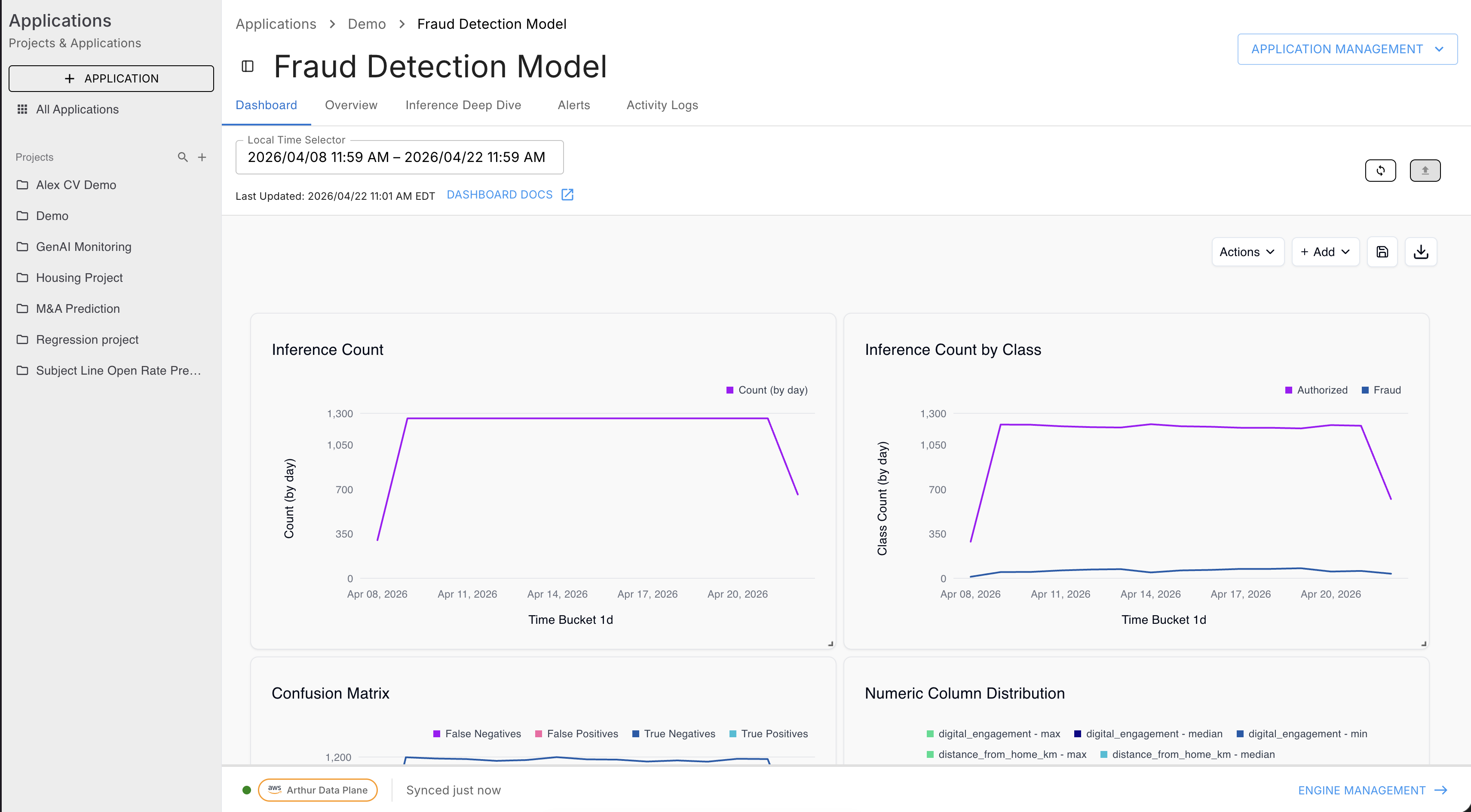
Dashboard Layout
The dashboard lives at the application level:
Applications → [Project] → [Application] → Dashboard tab
| UI Element | Description |
|---|---|
| Local Time Selector | Date range picker that controls all charts on the page. Dates filter every chart's {{dateStart}} and {{dateEnd}} template variables. |
| Last Updated | Timestamp showing when metrics were last computed for this application. |
| DASHBOARD DOCS | External link to this documentation. |
| Refresh (circular arrow icon) | Triggers a metrics recalculation job — see Refreshing Metrics. |
| Actions dropdown | Dashboard-level actions (fork, save, etc.). |
| + Add dropdown | Add or create charts; add a global filter. |
| Save (floppy disk icon) | Saves layout changes to the current dashboard. |
| Download (down-arrow icon) | Downloads the current dashboard as an image. |
Adding Charts
The + Add dropdown offers four options:
| Option | When to use |
|---|---|
| Add chart | Pick an existing chart from the shared library (Global Charts or My Charts) |
| Create chart | Build a new chart from scratch with the full SQL editor and chart builder |
| Create chart (basic) | Simplified chart builder — no SQL, select metric and aggregation from dropdowns |
| Add filter | Add a global filter control that affects all charts on the dashboard |
Add Chart — Chart Library
Clicking Add chart opens a slide-out panel.
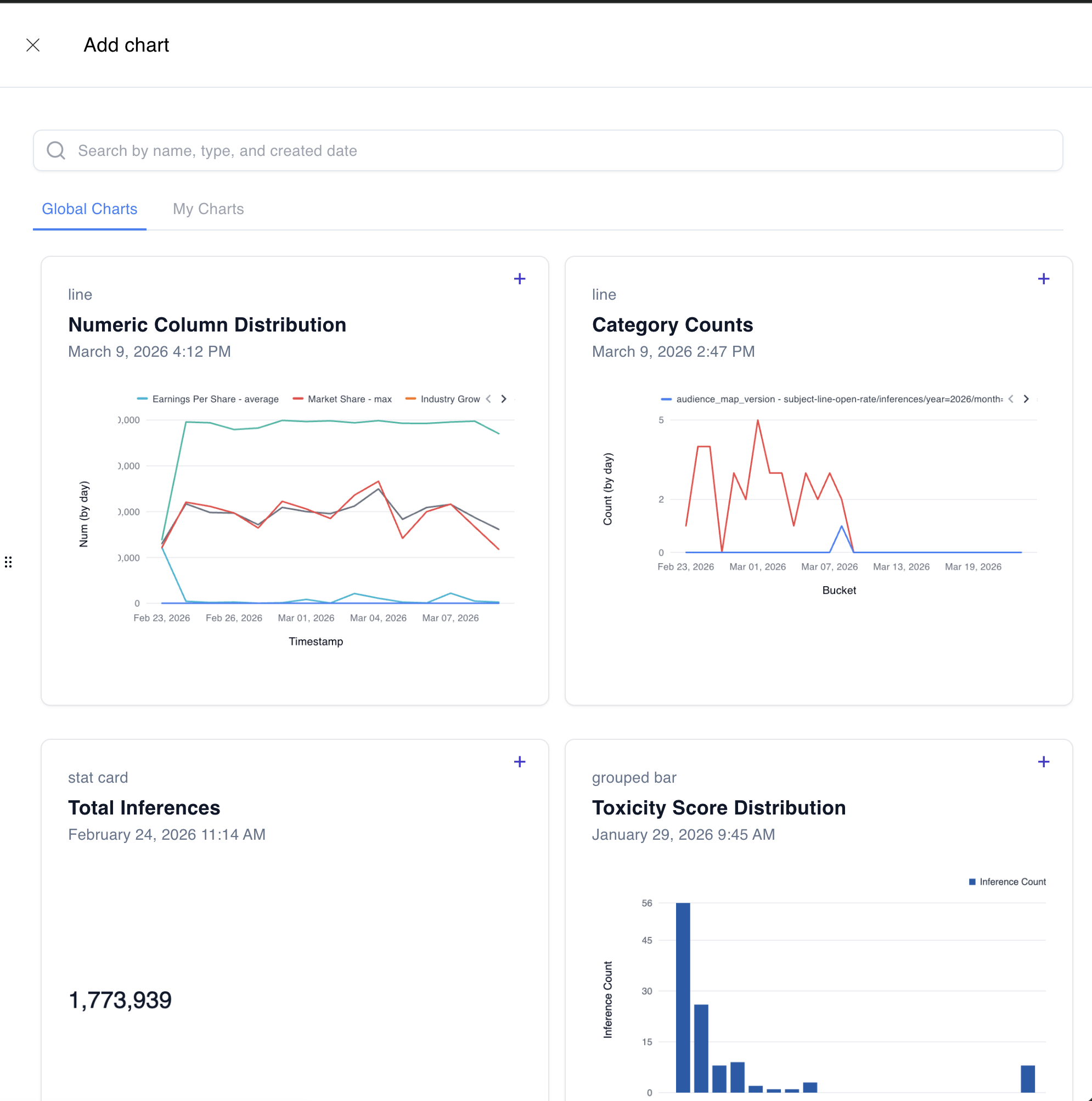
Global Charts — charts created by any member of your workspace and saved to the shared library. These are reusable across applications.
My Charts — charts you have personally created and saved.
Use the search bar to filter by name, type, or created date. Click + on any card to add that chart to the current dashboard.
Charts added from the library are linked copies — the underlying SQL query is the same shared chart definition. Editing the chart edits it everywhere it is used.
Create Chart — Full Chart Builder
Clicking Create chart opens the full chart creation panel.
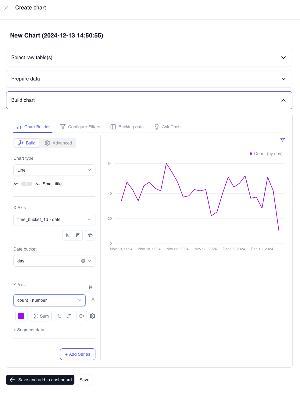
Step 1 — Name
Click the default title (New Chart (timestamp)) and replace it with a descriptive name.
Step 2 — Select raw table(s)
Choose the TimescaleDB view your query will run against:
| View | Use for |
|---|---|
metrics_numeric_latest_version | Count, sum, and scalar numeric metrics |
metrics_sketch_latest_version | Distribution and percentile metrics stored as KLL sketches |
If your chart needs both (e.g., joining error rate with latency), select either view — the SQL editor accepts any valid query including joins across both views.
Step 3 — Prepare data
Write your TimescaleDB SQL query in the Query builder editor. Click Preview data to run the query and inspect the returned columns before building the chart.
-- Minimal example: daily inference count
SELECT
  time_bucket('1 day', timestamp) AS bucket,
  SUM(value) AS count
FROM metrics_numeric_latest_version
WHERE metric_name = 'inference_count'
  [[ AND timestamp BETWEEN '{{dateStart}}' AND '{{dateEnd}}' ]]
GROUP BY bucket
ORDER BY bucket
Template variables available in chart SQL:
| Variable | Description |
|---|---|
{{dateStart}} | Start of the dashboard date range (cast to timestamptz) |
{{dateEnd}} | End of the dashboard date range (cast to timestamptz) |
The [[ AND ... ]] syntax marks optional filter clauses that are only applied when the variable has a value. Use this pattern for all date range filters.
For the full SQL reference —
time_bucket,time_bucket_gapfill, sketch functions, CTE patterns — see Custom Graphs.
Step 4 — Build chart
The Build chart section has four tabs:
Chart Builder (Build / Advanced sub-tabs)
- Chart type — Line, Stat Card, Grouped Bar, and others
- X Axis — select the column for the horizontal axis (typically your time bucket column)
- Date bucket — sets the time granularity for the X axis (day, hour, week, etc.)
- Y Axis — select the column(s) to plot; configure aggregation (Sum, Avg, etc.) per series
- + Segment data — under each Y Axis series, breaks the series into multiple lines by a dimension column (e.g.,
prompt_version_id). This is how "by version" charts work. - + Add Series — adds a second Y Axis series (useful for multi-metric charts)
Configure Filters
Add chart-level filter controls (independent of the global dashboard filter).
Backing data
Inspect the raw query result that drives the chart.
Ask Dash
Use natural language to ask an AI assistant to modify the chart query or configuration.
Step 5 — Save
Two buttons appear at the bottom of the panel:
| Button | What it does |
|---|---|
| ← Save and add to dashboard | Saves the chart and immediately places it on the current dashboard |
| Save | Saves the chart to your library without adding it to the current dashboard |
If your SQL query contains {{dateStart}} or {{dateEnd}} variables that are not yet mapped to a dashboard filter, a "Missing variable filter mappings" modal will appear after saving. Use the dropdowns to link DateStart and DateEnd to the corresponding dashboard filter, then click Apply mappings. Without this step, the date range picker will have no effect on the chart.
Actions Dropdown
The Actions dropdown in the top toolbar contains dashboard-level operations such as forking (cloning) the dashboard.
Dashboard scope
When cloning or creating a dashboard, you choose a scope:
| Scope | Visibility |
|---|---|
| Workspace | Visible to all members of the workspace |
| Project | Visible to members of a specific project |
Custom dashboards appear in the Analytics section of the left sidebar under Workspace Dashboard and Project Dashboard.
Refreshing Metrics
Manual Refresh
The Refresh button (circular arrow, top right) triggers an immediate metrics recalculation job.
- Click the refresh icon.
- In the Refresh Metrics dialog, select the date range to recompute.
- Submit — Arthur queues a
MetricsCalculationjob. - When the job completes, a new metric version is created and the Last Updated timestamp advances.
Scheduled Refresh
To refresh metrics automatically on a recurring basis, use Schedule a data refresh (accessible from the refresh icon or the Actions menu).
| Field | Description |
|---|---|
| Schedule Name | A label for this schedule |
| Repeat Every | Interval-based frequency — enter a number and select a unit (Minutes, Hours, Days, etc.) |
| Cron Expression | Alternative to interval — enter a standard cron expression for precise scheduling (UTC time) |
| Lookback Period | How far back each refresh run recomputes — e.g., Last 60 Minutes recomputes the most recent 60 minutes of metrics on every run |
Click Save to activate the schedule.
Each refresh — manual or scheduled — creates a new metric version. The
_latest_versionviews automatically return data from the most recent version. To query historical versions, see Metrics Versioning.
Add Filter — Global Dashboard Filter
+ Add → Add filter inserts a filter control widget onto the dashboard. Once added, setting a filter value narrows all charts on the page that reference the linked dimension.
Common use cases:
- Filter all charts to a specific
model_versiondimension - Narrow the view to a particular
environment(e.g., production vs staging)
Permissions
To add, remove, or edit charts on a dashboard, you need the Editor role on the workspace. Without it, the dashboard is read-only — charts are visible but the + Add and Actions controls are hidden.
Next Steps
| Goal | Where to go |
|---|---|
| Write chart SQL with sketches, CTEs, gap-fill | Custom Graphs |
| Define a new metric to visualize | Custom Metrics |
| Understand how metric versions work | Metrics Versioning |
| Set up alerts when a metric crosses a threshold | Alerts & Alert Rules |
Updated 2 months ago